I Analyzed 5 Years of My Own Grocery Receipts. Here's What Happened After I Built a Meal-Planning App.
I'm the founder of MaSemaine, a meal-planning app. So when I tell you our family's grocery bills dropped after we started using it, you should be skeptical. I would be.
That's exactly why I didn't write this from memory or vibes. We're a family of five — three growing kids who eat like it's a competitive sport — so the bills aren't small ($1,700–$2,000 a month). I exported five years of our family credit-card statements — September 2021 to June 2026, 3,636 transactions — and ran the numbers properly. No cherry-picking. No flattering definition of "groceries." I tried hard to make the result disappear, and it didn't.
Here's what I found, including all the reasons you might be right not to trust it.
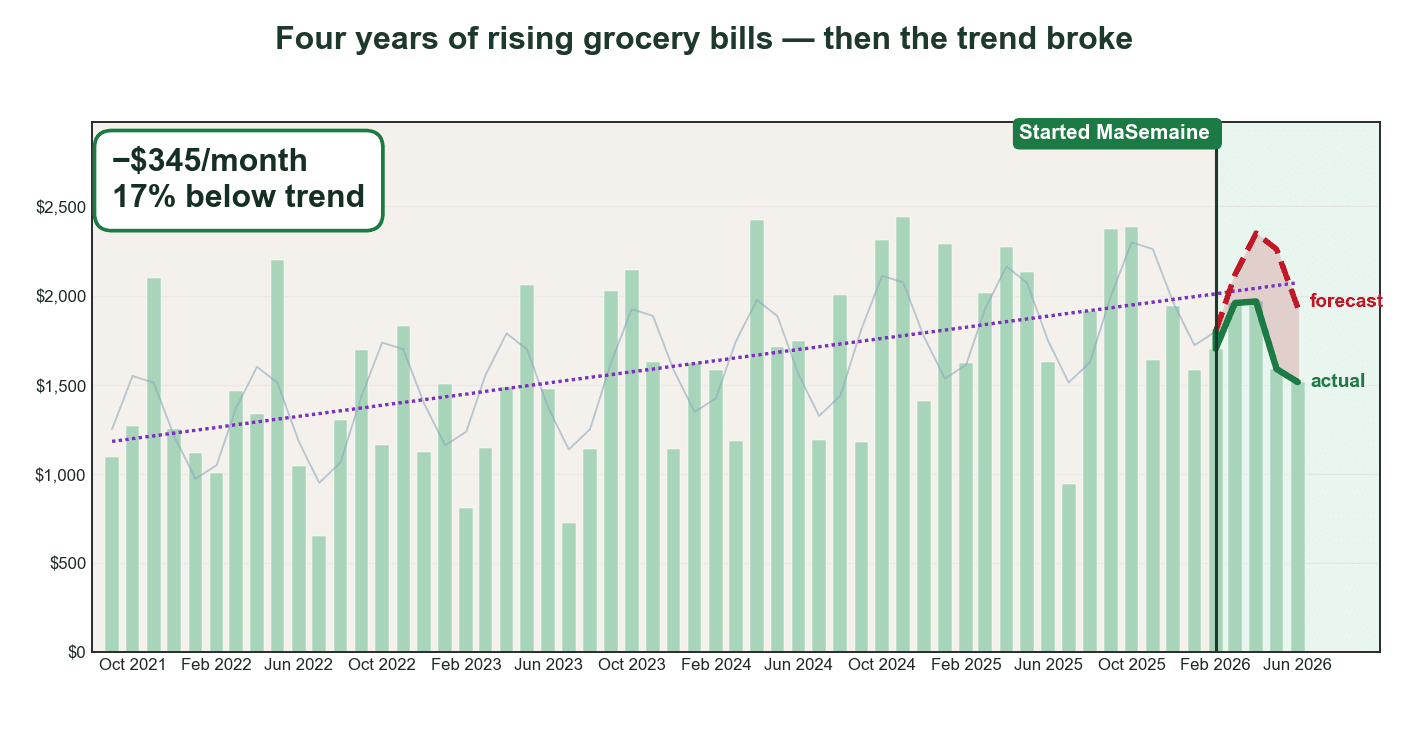
The one chart that matters
For four years, our grocery spending climbed at roughly $187 more per year — about 13% per year, compounding. Then in February 2026 we started planning every week with MaSemaine. Here's what the spending did against its own trend.
The headline number: in the five months after we started (February–June 2026), we spent about $1,726 less than the trend forecast — roughly $345 per month, or 17% below where the trend said we'd be.
Before you take that at face value, let me argue against it.
Why you should distrust this number (and why I still believe it)
I'll be blunt: a five-month result from the person selling the app is the weakest kind of evidence. So I stress-tested it.
Test 1: Does it survive changing the definition of "groceries"?
The easiest way to fake a result like this is to define "groceries" in whatever way makes the drop look biggest. I did the opposite. I used a conservative, inclusive definition: Metro, Maxi, IGA, Super C, PC Express (Provigo/Loblaws pickup), and Costco warehouse purchases. I did not hand-pick the stores that happened to fall the most.
Then I re-ran it with looser and stricter definitions — including and excluding Costco, including and excluding smaller merchants. The drop held at 16–19% ($335–$411/month) no matter how I sliced it. It's not an artifact of one definition.
Test 2: Does a completely different method agree?
The trend forecast is one method, and it has assumptions (more on that below). So I threw it out and used a method with no model at all: same-month, year-over-year. I compared each month of 2026 directly to the same month in 2025 — February 2026 vs February 2025, March vs March, and so on.
That independent method shows roughly 14% lower, with 5 of the 6 months down year-over-year. Different math, similar answer.
So three approaches — trend forecast, definition-robustness, and year-over-year — all land between 14% and 19%. That convergence is the real reason I trust it more than any single number. I'm framing the result as ~$345/month, 16–19%, not a single decimal-point figure, on purpose.
Here's the thing that surprised us most, and it has nothing to do with a spreadsheet. The fridge looks emptier now. At first that felt wrong, like we'd forgotten something at the store. But we never actually run short — we have exactly what we need for the week, and not the pile of extras that used to slowly turn into garbage in the back of the crisper. What's left in there is mostly fresh, nutrient-dense food. Less stuff, more of it eaten, almost nothing wasted.
Proof the timeline is actually real
Here's a fair objection: how do you even know the app existed when I say it did, and didn't somehow influence those earlier rising years? The dates are publicly checkable.
The masemaine.ca domain was registered on January 31, 2026. Anyone can verify that themselves — run whois masemaine.ca and look at the third-party WHOIS registration record. Those records are kept by the registry, not by me, and they can't be backdated. The codebase itself started on January 10, 2026 (the first commit), and the family started using the app in February 2026 — that's the marker on the chart.
Why does this matter? Because it means MaSemaine did not exist during the 2021–2025 rising-cost years. It literally couldn't have been a hidden cause of the earlier climb. That makes the "before" period a genuinely clean baseline — the four-year rise happened in a world without this tool, full stop. That's a real strength of the setup, not spin.
Now the honest limit on that proof: WHOIS and build dates prove the tool is new and real. They do not prove that I personally shopped with it every week — and remember, I'm the founder testing my own product, which is the n=1 conflict of interest I've already flagged. The most direct evidence I can offer for actual use is my own account history.
The five reasons this could still be wrong
Honesty means putting the weaknesses above the fold, not in a footnote. Here are the real ones.
1. It's only five months of data. This is early-results territory, full stop. Five months is suggestive, not proven. A single big Costco run in July could dent it. I'll update this post when I have a full year.
2. There's real month-to-month noise. The trend model fits the historical data with an R² of 0.48 — meaning it explains about half the variation, and the rest is noise. That's why I refuse to claim "exactly $345." The honest version is a range: roughly $300–$400/month, 16–19%. Anyone quoting a precise figure off a model like this is overselling.
3. Costco mixes food with everything else. A big chunk of our spend is Costco warehouse runs, and a Costco receipt has rotisserie chicken sitting next to paper towels and a winter jacket. The credit-card line can't separate them. I included Costco because excluding it would be the flattering choice — but it does add fuzziness to what counts as "grocery."
4. The counterfactual is an assumption, not proof. The whole "$1,726 below forecast" claim rests on assuming our prior four-year trend would have continued if we'd done nothing. But breaking that trend is exactly what the app is supposed to do — so I'm using the thing I'm trying to prove as part of the proof. That's a real logical soft spot. Maybe 2025 was just an unusually high baseline and 2026 was always going to regress. I can't fully rule that out with five months.
5. My measurement window conveniently skips the most expensive month of the year. This is the one I'd hammer hardest if I were trying to debunk myself. The post-MaSemaine period is only February–June 2026 — five months that include the spring peak but completely exclude the fall, and especially November, which my five years of data show is the single highest-spending month every year (the Costco holiday bulk-buying I described above). In other words, the window I happen to have flatters the result: it caught one of the two annual peaks and missed the bigger one. A favorable accident of timing can do a lot of the work that I'd like to credit to the app. So the honest verdict is this is an early signal, not a verdict. The real stress test is whether the savings survive the fall and that November Costco peak — and that's data I simply don't have yet. I'll only believe my own number once it holds through a full year, November included.
I'm not going to pretend these away. They're why the title says "here's what happened," not "this app saved me $1,726."
The part that isn't in question: the climb was steep
Set aside the recent drop for a second. The four-year rise is the most solid thing in this dataset, and it's worth sitting with.
Our grocery spending grew about 13% per year. To put that in context: according to Statistics Canada, the Consumer Price Index for food purchased from stores rose 1.3% in 2024 and 3.2% in 2025 on an annual-average basis. Food prices were climbing — but nowhere near 13% a year.
So most of our increase wasn't inflation. It was us — more Costco bulk runs, bigger carts, more "we'll figure it out later" buying. Prices went up well above typical grocery inflation only because our volume and habits drifted upward. That's actually the encouraging part: the portion you control — how you shop, not what things cost — turned out to be the bigger lever.
(I'm deliberately not slapping a single "food inflation was X%" sticker on our gap, because the honest comparison is qualitative: our bills grew far faster than the official food-from-stores index, and the difference was behaviour, not price tags.)
What the spending pattern actually looks like
One thing five years of data makes obvious: grocery spending is seasonal and bimodal. Two peaks a year — spring (April–May) and fall — with November the single highest month, driven by Costco holiday bulk-buying.
The lowest month? July. And I can prove why: the same months with the lowest grocery spend are the months with the highest travel charges on the card. We're not eating less in July — we're away, eating elsewhere. Specifically, we take our family vacation in July, usually out of the country — and any groceries bought abroad simply aren't in my numbers, because the filter only counts Canadian chains like Metro, IGA and Costco. So July's dip isn't real savings; it's mostly us being elsewhere, with that foreign spending excluded by design. (It also means the summer months slightly understate our true food spending — worth knowing, though it doesn't touch the February–June result, which has no July in it.) That kind of cross-check is exactly the sort of thing you only catch when you look at the raw data instead of trusting a gut feeling.
So what actually changed in February 2026?
Nothing dramatic. We didn't go on a budget. We didn't clip coupons. The only real change was that we started deciding the week's meals before shopping, and we let that week's flyer deals shape the menu instead of buying on autopilot.
That's the whole mechanism, and it's boring on purpose: plan the week → build the list from the plan → buy that, not the impulse cart. The app just makes that take five minutes instead of an hour of willpower I don't have on a Sunday night.
How this works without willpower
Here's the actual flow we use every week.
Step 1 — The week gets decided in one place
Instead of standing in the kitchen at 5 p.m. asking "what's for supper," the week is already planned. That single shift — deciding before shopping instead of during the week — is what kills impulse spending.
Step 2 — This week's deals shape the menu
This is the lever that moved our numbers. When chicken thighs are on sale, the plan leans on chicken that week. The app scans the local flyers and matches deals to recipes automatically, so the menu follows the savings instead of fighting them.
Step 3 — A precise list, priced before you go
You walk in with an exact list instead of a vague idea. Everything is there, nothing extra is. The list of what not to buy is as valuable as the list of what to buy.
Frequently Asked Questions
Isn't five months too short to prove anything? Yes — and I say so plainly in the post. Five months is "early results," suggestive not proven. What makes me take it seriously isn't the duration, it's that three independent methods (trend forecast, year-over-year, and definition-robustness checks) all land between 14% and 19%. I'll update with a full year of data.
How do I know you actually started in February 2026?
The timeline is publicly checkable. The masemaine.ca domain was registered on January 31, 2026 — run whois masemaine.ca yourself; those third-party registry records can't be backdated. The codebase's first commit was January 10, 2026. So the app provably did not exist during the 2021–2025 rising-cost years, which makes that "before" period a clean baseline it couldn't have influenced. The honest caveat: those dates prove the tool is new, not that I personally used it every week — I'm the founder testing my own product. For that, the most direct proof is my account's "member since February 2026" history.
Did you cherry-pick which stores count as "groceries"? No, and that was the whole point. I used a conservative, inclusive definition (Metro, Maxi, IGA, Super C, PC Express, Costco warehouse) and the drop held at 16–19% no matter how I redefined it. Cherry-picking would have made the number look better, not worse.
How can you separate Costco groceries from Costco household goods? I can't, fully — the credit-card line lumps them together. I included Costco warehouse purchases above $125 (excluding Costco gas) as a conservative call. It adds noise, which is one reason I report a range, not a single number.
Was this just inflation going up, then coming back down? Unlikely to be the whole story. Statistics Canada's food-from-stores index rose ~1.3% in 2024 and ~3.2% in 2025 — while our bills climbed ~13% a year. Most of our increase was volume and habits, not prices. The drop coincided with a deliberate change in how we shopped, not a change in prices.
How do I know the trend "would have continued"? You don't — and neither do I. That's the honest weak point. The counterfactual assumes our four-year trend would have kept rising, which is exactly what the app claims to break. I flag this as an assumption, not proof. The year-over-year method (which makes no trend assumption) is there precisely to give a second opinion.
What actually changed in your routine? We started planning the week's meals before shopping and let the weekly flyer deals shape the menu. That's it. No coupon-clipping, no extreme budgeting — just deciding before buying, which the app turns into a five-minute task.
Will you share the data or method? The method is described in the post: a linear-trend-plus-seasonal fit on 2021–2025 data (R²=0.48), extrapolated to 2026, cross-checked against same-month year-over-year and multiple grocery definitions. Concretely, the model is a linear trend plus two seasonal harmonics, fit by ordinary least squares on the monthly totals:
spend(t) = a + b·t + c1·sin(2πt/12) + d1·cos(2πt/12) + c2·sin(2πt/6) + d2·cos(2πt/6)
where t is the month index. The a + b·t part is the linear trend (the long, slow climb); the first sin/cos pair is the 12-month annual cycle; the second pair is the 6-month semi-annual cycle. That second harmonic is what captures the bimodal spring/fall spending pattern I described earlier — a single annual sine wave can only produce one peak per year, so it physically can't reproduce two. The underlying receipts are personal financial data, so I'm sharing the methodology and the chart, not the raw statements.
Read more: